Porto Cathedral Architecture Guide | Romanesque, Gothic, Baroque Layers
Understand Porto Cathedral's architecture through a simple expert-style framework covering structure, ornament, and spatial transitions.
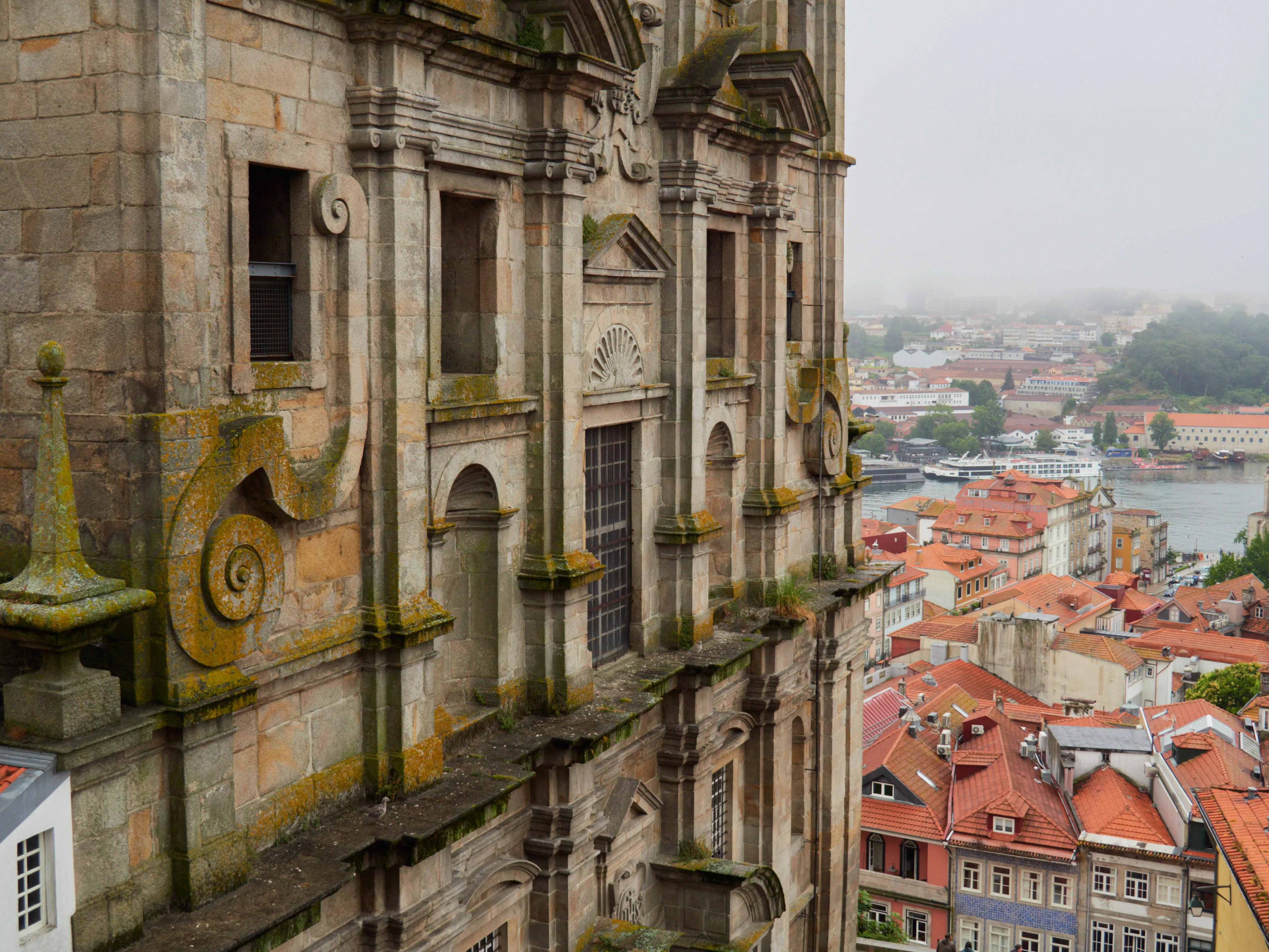
If architecture ever felt intimidating, Porto Cathedral is the perfect place to reset. You do not need jargon first; you need a method.
The 3-pass method
Pass 1 - Mass and silhouette
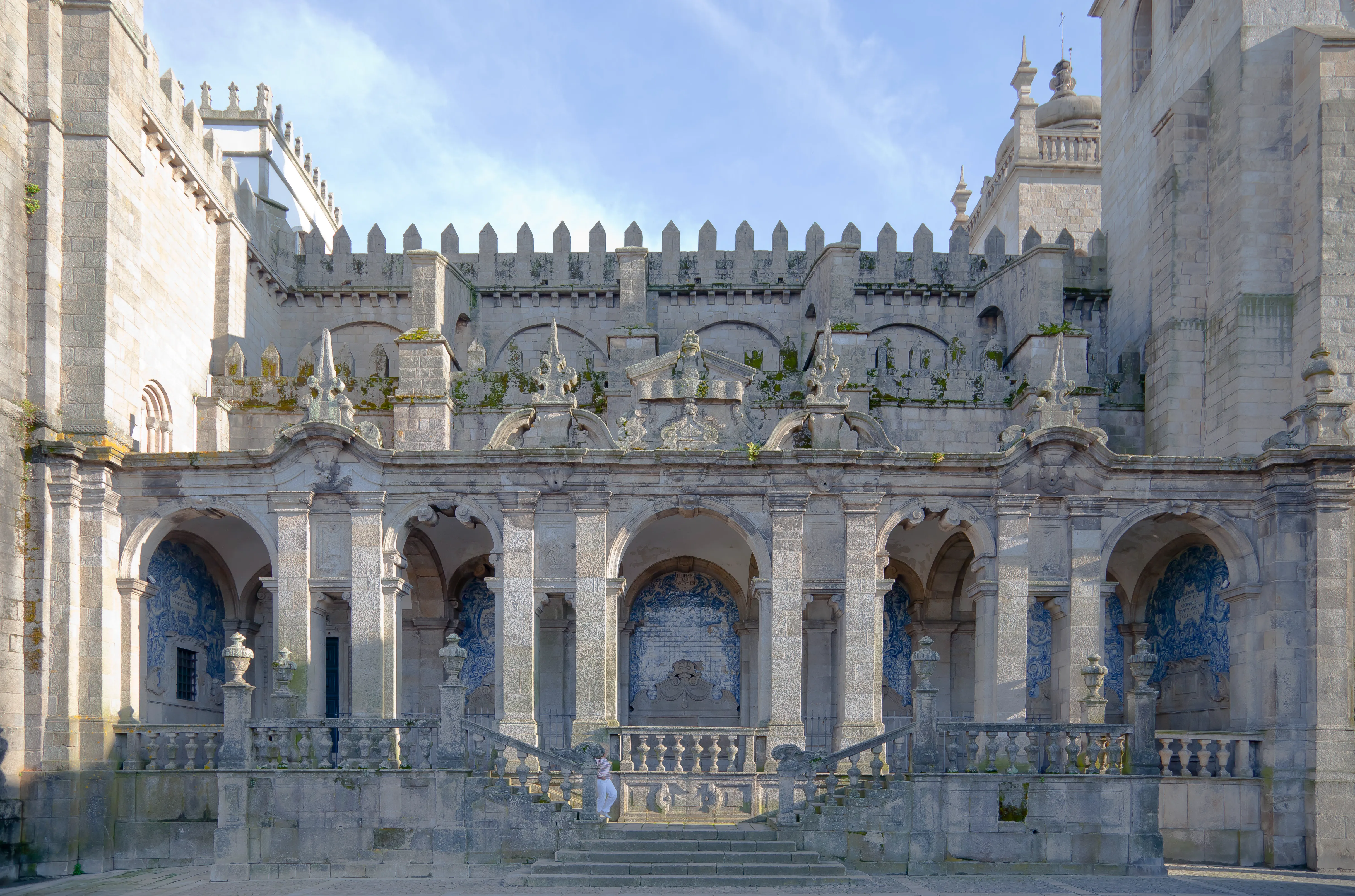
Stand far enough to see the full outline. Ask: does it feel light or heavy? Here, the answer is unmistakable: weight, anchoring, defense.
Pass 2 - Openings and rhythm
Track arches, windows, and vertical divisions. Notice where repetition stabilizes the facade and where decorative accents interrupt that rhythm.
Pass 3 - Surface and narrative
Move close. Stone texture, carved transitions, and restoration joints become visible. This is where centuries touch each other.
Cheat sheet
| Clue | Likely reading |
|---|---|
| Thick wall impression | Romanesque inheritance |
| Pointed vertical emphasis | Gothic influence |
| Ornament-rich interior elements | Baroque interventions |
Good architectural reading is disciplined curiosity.
Try this challenge: describe one portal in 50 words, then in 15 words, then in 5. Precision sharpens perception.
Reading transitions, not only styles
Beginners often search for labels first: Romanesque, Gothic, Baroque. Labels help, but transitions teach more. Porto Cathedral is especially rich because boundaries between phases are often visible in joints, proportions, and decorative intensity.
A useful trick is to follow one vertical line from ground to roof and note where language changes: heavy to light, plain to ornate, horizontal calm to vertical tension. These moments reveal where design priorities shifted.
Architectural literacy grows through repeated looking, not perfect terminology.
Field notes prompt
Element observed:
What feels oldest here:
What feels later:
One unresolved question:
By your second pass, the cathedral usually feels less mysterious and more legible.
Về tác giả

Porto Cathedral Editorial Team
Cẩm nang này được viết để giúp bạn cảm nhận Nhà thờ Porto không chỉ như một điểm check-in, mà như một không gian có chiều sâu lịch sử, nơi mỗi nhà nguyện, lối đi đá và góc nhìn đều kể một câu chuyện sống động.
Tags
Comments (0)
Loading comments...